A key component of any inbound marketing campaign is a landing page. And on every landing page, you will have a form where a visitor can submit their personal information in return for an ebook, to attend an event, to watch a video etc. One of the best and easiest ways to improve conversion rates on your landing pages is to optimise these forms. You can have the best copy in the world and perfect images on the landing page but if your form isn't easy to fill out or overwhelms people, it won't convert.
So very briefly, we will go through 9 easy ways to increase conversion rates on landing pages that can be implemented with little effort but potentially have big results.
1. How Long Should Your Form Be?
There is no right or wrong answer when it comes to what the length of a form should be or how much information you should try to collect. But if you want your forms to convert, put yourself in your visitor's shoes. Think about how they feel when they see the form.
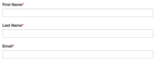
If it's their first visit to your site, do you really think they want to fill in line upon line of information? The answer to this is generally "no". So consider looking for just their name and email address to start with.
Alternatively, if you want to know a little more about your visitors/leads, you can include additional fields that are not required fields. Then leave it up to your visitor whether they want to fill them in or not.
 V's
V's 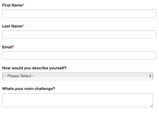
If this is the route you take, you need to test different variations of your form - one short form and one longer form with optional fields. Even vary them by the questions that you ask.
Remember that if you are using marketing software which has smart form and progressive profiling functionality, you can use it to track your visitors, and on their second visit, it could prompt them for one or two additional pieces of information and so on.
2. To Submit or Not to Submit?
If you are trying to achieve good conversion rates on your landing pages, then don't use the word "Submit" on your call to action button. There are better ways to entice your visitor to click. Be descriptive.
Try titles like "Get Your Free ...", "Download your ...", "Join our ...", "Get it before ...", "Start....","Try the..." etc. Use Google to get some ideas if you need inspiration!
3. Make it Bold and Beautiful
The careful visual design of your call to action button is very important.
- Bold your CTA text: This makes the words stand out and will catch your visitor's attention making them more likely to convert.
-
Make your CTA button large enough to be seen: The button should be visible and obvious to visitors when they land on the page.
-
When choosing a colour for the CTA button, make sure it stands out.
- Try and keep the CTA above the fold if possible.
4. Make it one column
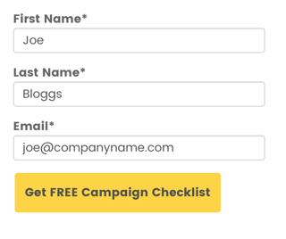
Make your form fields fit into one column. People can interpret forms inconsistently when fields are spread over a number of columns.
5. Align Form Labels Vertically
This is especially important for mobile usability. Even from a space perspective, it's very difficult to have labels on the left and the field on the right.
Present the label and input close together, and make sure there is enough height between the fields so users don’t get confused.
It's proven that people fill out top-aligned labelled forms faster than left-aligned labels. But when dealing with large data entry forms, you may need to consider left aligned to reduce perceived height.
6. Design to Look Shorter
Forms that look shorter than they actually are, convert better.
People often won’t fill out a form because it “looks” long and would take up too much time to fill out. So style them to look shorter. You can do things like reducing the spacing between fields. In the case of a large form, left align the labels but make sure it looks good on mobile too.
7. Inline Form Validation
There's nothing worse than getting to the end of a form (particularly a long one) and being notified of made mistakes further up. Validate as the person finishes entering data into each field. Instead of using a pop-up to notify them of issues, try putting the validation message on the form. Remember to highlight in a strong, eye-catching colour.
8. Single Action
It is much better to include only one action for the user to take. Having more than one is very distracting for people, and it may result in them not clicking either CTA. If you have to include 2 CTA's, then colour the most important CTA so that it stands out.
9. A/B Testing
A/B testing different variations of forms and landing pages will help you succeed in your quest for better conversion rates. Use testing to find out what variations work best for converting your visitors. If you don't, you may miss opportunities to attract new leads and customers.
So those are our 9 easy ways to increase conversion rates on landing pages. Hopefully, you will find some of these tips useful. Review your existing landing pages, benchmark the metrics and start making some changes. It's good practice to plan out and keep a log of changes as you tweak campaigns so that you can see what changes have the most impact and apply these elsewhere.
If you'd like to learn more about lead generation, then download our guide, which covers using Content and Offers, Calls to Action, Landing Pages, Forms and Channels.
If you would like some advice on lead generation or conversion optimisation, or any other aspect of marketing, please contact us for a free consultation.
Other related resources you may find useful relating to this topic are:-
- Lead Generation Magnets for SaaS and Software Companies
- 9 Website Must Haves for Lead Generation in SaaS & Technology Companies
- Guide to Running an Inbound Marketing Campaign
Even if you're not a SaaS company they still contain some great tips relevant to any business!


